New Net Promoter ScoreSM data visualizations provide deeper insight into the behaviors that drive satisfaction
“NPS Everything”! That’s the recommendation of Bessemer’s 2017 State of the Cloud report. SaaS companies (and lots of other companies — including 66% of the Fortune 1000) are turning to Net Promoter Scores as a key metric of company performance. SaaS companies have an added benefit when it comes to capturing and processing NPS scores, they can collect feedback directly in their application. Since we first rolled out NPS surveys 18 months ago, our customers have seen 2x to 10x higher response rates by moving from email to in-app delivery.
NPS is a powerful metric, providing a quantifiable measure of customer delight that companies can use to benchmark against their industry, competitors, and themselves. However, its value can be somewhat limited for product teams. The product experience itself is often the biggest influencer in customer satisfaction, but the NPS score itself doesn’t say how. The qualitative part of the survey can provide some insight, but until now product teams didn’t have a clear way to understand how product usage corresponded to NPS scores across an entire user base.
Introducing A Whole New Way to Analyze NPS Results
In the SaaS industry, truly understanding your users requires both quantitative analysis and qualitative feedback. You want to see what your users do in your product, and also understand the why behind their behavior — their motivation and how they perceive the experience. We are taking the same approach to NPS surveys.
The Pendo platform collects both product usage data and survey feedback. Our new NPS analysis features bring these two data sources together in several unique data visualizations that allow product teams to easily understand how their users’ experience drives (or doesn’t drive) customer delight. These new visualizations make the analysis intuitive and easy, and make your NPS scores much more actionable.
Page and Feature Usage by NPS Detractors and Promoters
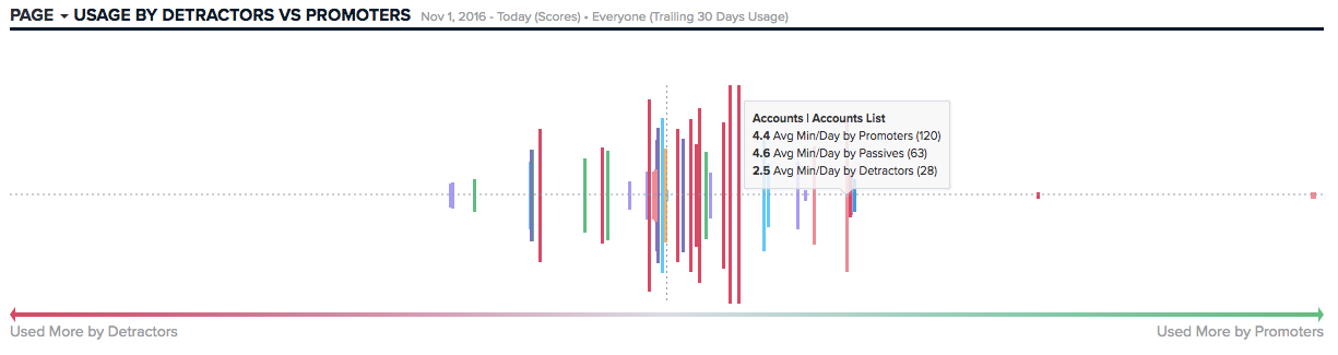
The first new visualization shows which parts of your product are used most heavily by your NPS respondents. The chart allows you to quickly see which pages and features are used more heavily by your promoters and your detractors. The bars on the chart represent tagged pages or features within your application and the horizontal axis ranges from detractors to promoters. Pages and features are ranked based on the average time promoters and detractors spend on that page. So a page on the far left is one that is used much more heavily by detractors, and one on the right is used much more heavily by your promoters. The relative height of the bars represents total usage of a particular page or feature.
The graph allows you to quickly identify and drill into the areas of the product that are most closely associated with high and low net promoter scores. Pages used heavily by detractors might point to usability issues that can be addressed, while those used by promoters likely contain high-value functions that other users would benefit from adopting.
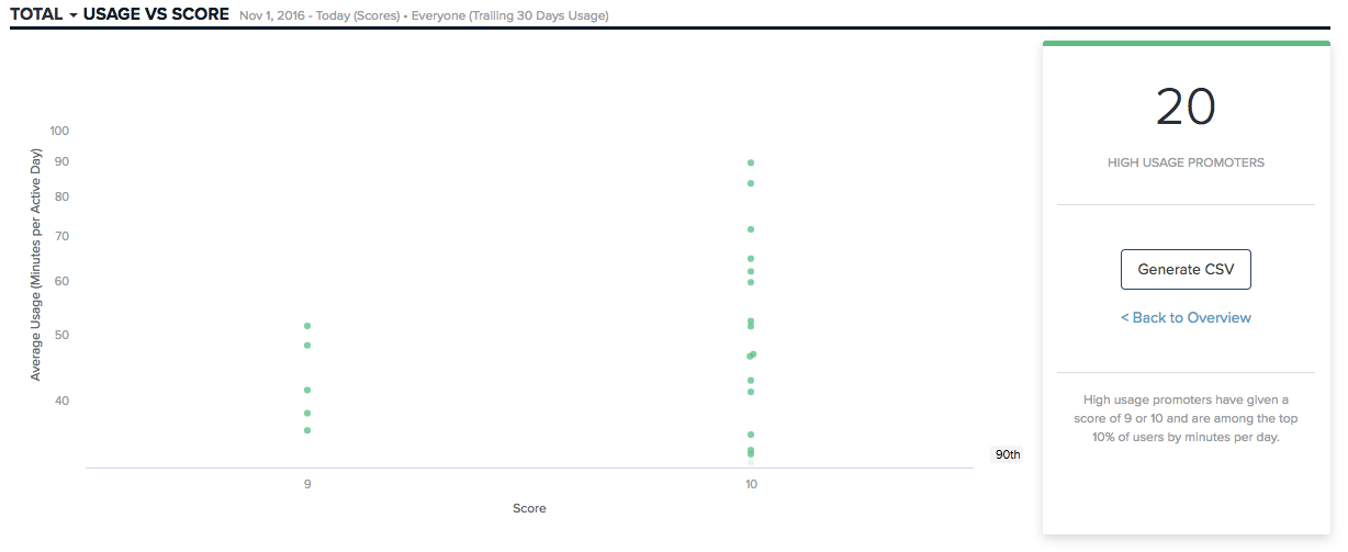
Usage Volume and Action Zones
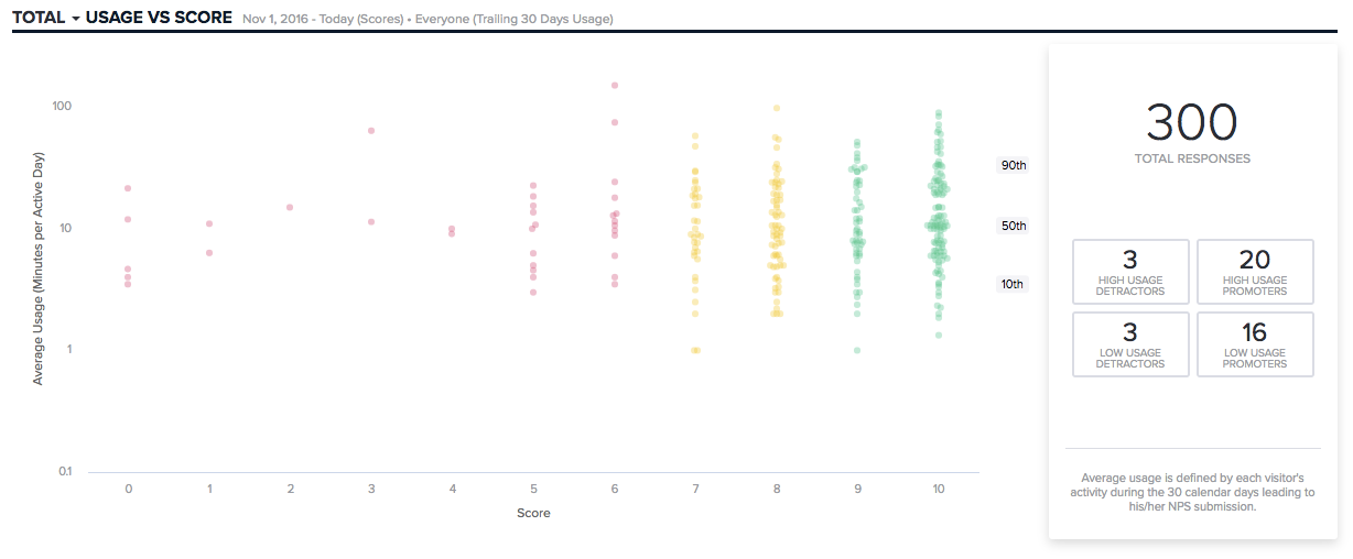
The second new visualization shows a distribution of all NPS responses plotted against total product usage. Responses are distributed across the 10th, 50th, and 90th percentile of total time in the application (minutes per day). The plot can be adjusted to show the distribution across the whole product, or individual pages or features.
The visualization automatically highlights 4 “action zones” in the graph — showcasing sub-segments of NPS responders who may be particularly actionable. For example, High Usage Promoters are respondents who have given an NPS score of 9 or 10, and are in the 90th percentile of users. These are people who use the product a lot and love it — perfect candidates to recruit for sales references or case studies. Whereas Low Usage Detractors may be folks who could become more satisfied if they were educated about features they haven’t used, and encouraged to spend more time in the product.
Quick Demographic Segmentation
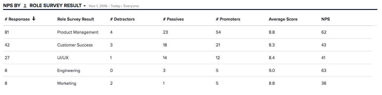
Another important way to analyze NPS responses is to look at how different user segments respond. An overall NPS score might hide significant variability across different user roles, customer sizes, or plan levels. Pendo already supported this level of segmentation, but along with the new NPS features we’ve added a quick table view that allows you to look at results across different user segments. Using the drop-down list, you can select any demographic information for your accounts or visitors, and quickly see the aggregated NPS responses.
Trends Over Time
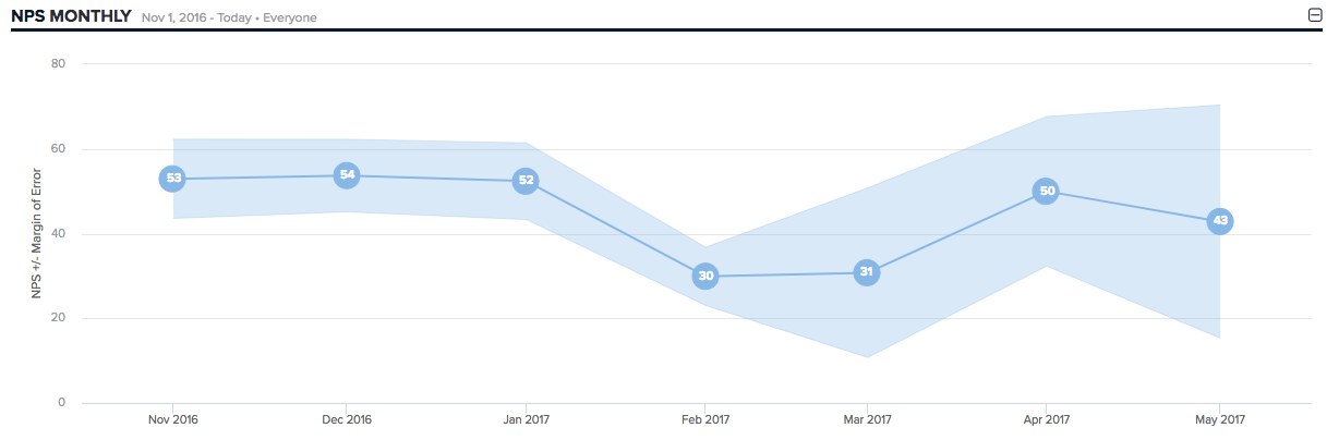
For most companies, the value in measuring NPS is to track the metric over time. Your NPS score can and should be compared to your industry average and your competitors, but one of the most valuable benchmarks is your own score. The goal of leveraging NPS as a metric is to focus the organization on delighting customers, and hopefully, that effort shows up for your scores over time.
Pendo now includes a trend view of your NPS score, showing how the score and margin of error adjust over time. The chart will show daily, weekly or monthly trends.
A New Way to Analyze NPS
This new feature is about making it easier for you to get more value out of your NPS programs. Knowing what user behavior or which user segments line up with the satisfaction can help you prioritize product improvements, and identify specific groups of users who would benefit from additional engagement.
To learn more about these capabilities, register for our live webinar on September 20th at 2PM ET. You can also play around with some of the new visualizations in our interactive sandbox.
Net Promoter, NPS, and the NPS-related emoticons are registered trademarks, and Net Promoter Score and Net Promoter System are service marks, of Bain & Company, Inc., Satmetrix Systems, Inc. and Fred Reichheld.
![[object Object]](https://cdn.builder.io/api/v1/image/assets%2F6a96e08774184353b3aa88032e406411%2F2f1fa13848a54351a70d3d6ff5b4ad75?format=webp)
![[object Object]](https://cdn.builder.io/api/v1/image/assets%2F660d4d0913e147ef991a54db871be261%2F9adf75a4b98946f799e5a904e0e37e5e?format=webp)