Table of Contents
What is a heat map?
A heat map is a visual representation of user interaction data, where color intensity corresponds to the concentration of specific user actions on your website or app.
Hotter or more intense colors represent areas of high user activity (popular buttons, frequently viewed content), while cooler colors indicate less activity or potential friction points. A heat map is like a visual representation from a thermal camera: areas where users interact the most appear “hot” on the heat map.
For instance, a heat map of a software application’s dashboard might show a vibrant red around a button that triggers a frequently used report. Conversely, a cool blue area around a specific settings menu might suggest users are having difficulty finding it.
Heat maps work by aggregating user interaction data over a defined period. This data can include clicks, cursor movements, scrolls, form submissions, and any other measurable user behavior you choose to track. Applications like Pendo’s product experience (PX) platform seamlessly collect this data and then map it onto a visual representation of your interface (webpage, app screen, etc.). The color intensity in each location reflects the frequency of a specific user interaction at that particular spot.
Heat maps offer valuable insights into user behavior patterns. They can help you:
- Identify areas of high engagement (e.g., popular buttons, frequently viewed content) – Heat maps can quickly reveal elements on your webpage or app that attract the most user attention. By understanding what resonates with users, you can optimize these (and other) elements for even better results.
- Uncover friction points (areas with low engagement or cool spots) – Conversely, areas of a heat map with cool colors might indicate features users are ignoring or having difficulty with. These could be little-used features, unnecessary features, elements with low visibility or that are hard to find, or other potential friction points that need further investigation.
- Inform design decisions by visualizing user behavior patterns on prototypes. During product design and development, heat maps can visualize user behavior patterns on prototypes or early versions of your product, you can identify areas that need improvement before launch.
- Measure the impact of changes (A/B testing) by comparing user interaction before and after implementing a new design layout. You can use heat maps to measure the impact of your changes on user behavior and engagement.
What are the benefits of using heat maps?
Besides the reasons described in “What are heat maps used for?” heat maps offer many benefits for anyone interested in understanding user behavior on their website or software application.
- Gain a quick and easy overview of user interactions with a color-coded image. Heat maps can highlight areas of interest without sifting through countless rows of clickstream data.
- Prioritize improvements based on areas of high engagement or friction points, focusing on updates that will have the most significant impact on the user experience (UX) and improve product adoption and conversion rates.
- Make data-driven decisions to optimize your product based on concrete user behavior data. Instead of relying on assumptions about user behavior, heat maps provide concrete data to support your design and development decisions.
- Improve UX by identifying and addressing usability issues, optimizing the UX, and creating products users love.
- Personalize the user experience within the product. With insights into user behavior patterns from heat maps, you can, for example, tailor content recommendations, highlight frequently used features, or offer contextual in-app guidance.
Who benefits from heat maps?
Just about any team or individual involved in the ongoing lifecycle of a software product or website can benefit from the insights provided by heat maps.
- Product managers can use heat maps to understand user behavior within a product, identify opportunities for improvement, and prioritize product roadmap decisions.
- UX/UI designers use heat maps to analyze and understand user interaction with the interface, so they can create and refine a more intuitive experience.
- Marketing teams use heat maps to analyze user interaction with marketing campaigns and landing pages to optimize performance.
- Content creators find heat maps valuable for tailoring their content to user needs by seeing which sections resonate most (and which are ignored).
What user interactions can heat maps help me visualize?
Heat maps typically visualize user interactions on a software screen or webpage, depending on the specific heat map tool you’re using and the data you choose to track. Here are some common examples relevant to both webpages and software applications:
- Clicks: Heat maps can show where users click the most on a webpage or within a software application screen. This can help you identify popular buttons, menu items, and other clickable elements (and those being ignored or overlooked).
- Scrolls: Scroll heat maps indicate how far down a webpage or application window users typically scroll and where they tend to stop scrolling. This visual data can reveal if users are missing important information located further down the page or deeper within the application.
- Element interactions: In software applications, heat maps can go beyond clicks to visualize interactions with various UI elements. This could include highlighting areas where users drag and drop items, use sliders or other input fields, or interact with specific functionalities within the application.
How can I use heat maps to identify areas of engagement?
Areas with intense colors indicate where users engage the most. This could be a popular button, a frequently viewed section of content, or a call to action (CTA) performing well. By understanding these elements, you can:
- Optimize for even better results (e.g., A/B test different button designs).
- Learn from successful elements: Analyze what makes these high-engagement areas successful (visually appealing design, clear copy, strategic placement).
How can I use heat maps to identify friction points?
Areas with cooler colors or lacking data points on a heat map can indicate features users ignore or struggle with. These might point to potential friction points that need further investigation.
- Identify neglected areas: Pinpoint sections of your website or app with minimal user interaction for further analysis.
- Diagnose usability issues: Cool areas around a search bar or form could indicate usability issues you must address.
- Prioritize improvements: Identify areas of low engagement to fix the most critical issues impacting UX and conversion rates.
What is a product heat map? How is it different than other heat maps?
A product heat map focuses on user interactions within a software product or application. It’s similar to website heat maps but can visualize additional interactions relevant to software products, such as:
- Feature usage: Product heat maps can show how often users use specific features within your software, identifying which features users find most valuable or useful and which ones might need improvement or removal.
- Navigation patterns: By visualizing how users navigate through your software, you can identify common user journeys and areas where users might get lost or confused.
Who benefits from product heat maps?
Product heat maps help numerous teams within product-led organizations to identify opportunities for improvement, validate design decisions, measure the impact of changes, and personalize the UX of their software.
- Product managers leverage heat maps to understand user behavior, identify areas for improvement, and prioritize product development efforts.
- UX/UI designers use product heat for insights into how users interact with the user interface design, leading to a more intuitive and user-friendly experience.
- UX researchers find heat maps valuable for gathering data on user behavior patterns and informing their research efforts.
- Marketing teams can use product heat maps to understand (and optimize) how users interact with in-app marketing campaigns and product features.
With such insights into user behavior patterns, you can personalize the UX within your product, tailor content recommendations, highlight frequently used features, and offer in-app guidance based on user actions—just for starters.
What is the difference between a heat map and a session replay?
Heat maps offer a high-level overview of user behavior patterns, showing what users interact with the most. They provide a valuable starting point for understanding user behavior but can’t tell you the “why” behind user actions. This is where session replays come in.
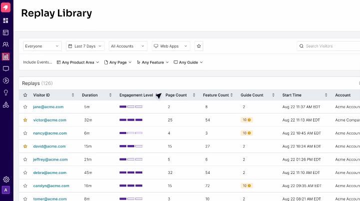
Session replays are a detailed, chronological record of user sessions within your product. They allow you to see precisely what users do on a webpage or app screen, including mouse movements, clicks, scrolls, and even form submissions. By watching session replays, you can better understand the user journey, pinpoint specific usability issues, and diagnose the root cause of friction points.
As an analogy, heat maps are like traffic maps, highlighting areas with high congestion (user activity). Session replays are like dashcam footage, showing you why there’s congestion (usability issues or unclear navigation, for example) and the specific user behavior that led to it.
When are heat maps sufficient, and when would session replays be more valuable?
Heat maps are great for identifying general user behavior trends and potential problem areas. They provide a quick snapshot of user interaction patterns across a large user base.
However, session replays are more valuable for understanding the specific user journey, uncovering usability issues, and diagnosing the root cause of friction points. Some scenarios where session replays would be more beneficial include:
Understanding user drop-off points
Heat maps might show where users abandon a specific task, but session replays can reveal why they’re abandoning it. For example, a user might drop off during checkout due to a confusing form or unclear error message.
Diagnosing usability issues
If a heat map shows a cool area around a button, a session replay can help you understand why users aren’t clicking it. Is the button poorly placed? Does the label accurately reflect its function?
Providing qualitative user feedback
While heat maps offer quantitative data, session replays can provide qualitative insights into user behavior. By watching users navigate through your product, you can observe their thought processes, frustrations, and areas of confusion.
How can I use heat maps alongside session replays for a more comprehensive UX analysis?
Heat maps and session replays are complementary tools you can use together for a more comprehensive UX analysis. Here’s how:
-
- Identify areas of interest with heat maps.
- Dive deeper with session replay in those specific areas.
- Triangulate data with other user research data for a well-rounded understanding of user behavior, motivations, and pain points.
What are some best practices for using heat maps effectively?
- Define clear goals: What user behavior patterns do you want to understand (engagement, friction points)?
- Segment your data: Analyze heat maps for different user groups (e.g., by device, location) to see how user behavior varies.
- Consider the timeframe: Daily heat maps might show peak activity times, while monthly maps reveal broader trends.
- Look beyond the hot spots: Cool spots can indicate opportunities for improvement or neglected features.
- Use heat maps with product analytics data: Combine heat maps with data or analytics to understand the causes behind user behavior patterns.