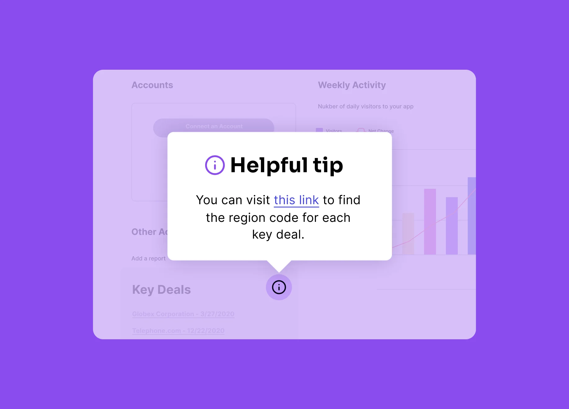
Table of Contents
What are tooltips?
Tooltips are in-app messages that typically appear when users navigate to a specific area or perform a certain action in the product. The most common type of tooltips are “hovers,” which are messages that appear when the user moves their cursor over a navigation menu, interactive element, or pre-determined “hotspot.”
Why should I use tooltips?
Tooltips are the most widely applicable and least disruptive form of in-app messaging, since they typically only use a small amount of screen real estate. They are especially useful for explaining features that may be less comprehensible by name alone, or answering frequently asked questions by providing additional context. Multi-step tooltips can also be employed to walk users through a new or changed workflow in the product.
As an example, WebPT, an electronic medical record platform for physical therapy practices, saw that users were having trouble completing online insurance forms. They used tooltips to explain how to fill out the fields that were causing the most confusion, helping reduce support tickets related to this area of the platform by half.
When should tooltips be used?
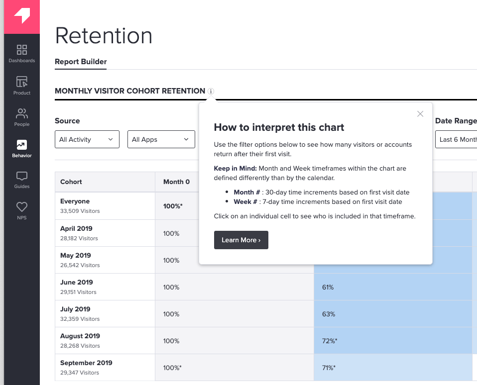
Tooltips should primarily be used to provide supplemental explanations for features that would otherwise clutter the UI if permanently displayed. Multi-step tooltip guides should only be used to guide users through new or changed functionality, with each step of the tooltip anchored to a specific feature within that workflow.
How to create effective tooltips?
The most important thing to remember about tooltips is that they should provide additional context to the intended user workflow. Here are a few ways to ensure your tooltips are effective:
- Testing is key: always test your tooltips before setting them live to ensure they add to, rather than take away or distract from, the user experience.
- Stay concise: the last thing you want is for your tooltip to add more confusion for the user. Be sure to keep the language in your tooltips clear, to the point, and as short as possible. This is when having a UX writer (or someone who is a microcopy expert) is beneficial, to ensure tooltips are written with the user in mind.
- Think through design: always consider your tooltip design with respect to the images and text around it. For example, it’s best to choose colors that contrast the background color, and to make sure tooltips don’t block any related text.