Target, iterate, analyze, repeat: How product ops can use Pendo to optimize product releases
When product ops is an established function, they’re responsible for generating insights to inform product strategy and advise decision makers. But as we’ve researched the role more, we’ve found that product ops is also often tasked with connecting the product to a company’s top and bottom lines. It’s easier said than done, of course, but the best way to understand if a product is doing what it’s supposed to do (i.e., generating and growing revenue) is to understand how it’s being used, and then continuously target, iterate, analyze, and repeat.
More specifically, teams need to be able to visualize product usage over time and by different user segments in order to know where the product is succeeding — and where it’s falling short. And with the rise in product ops and availability of product analytics tools, there’s now a dedicated function to own this continuous customization and optimization process.
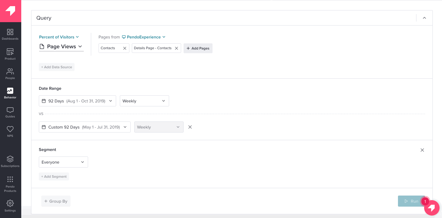
Below, we share how to use Pendo’s Data Explorer to visualize, track, and compare behaviors by cohort in your product and empower product ops pros (or anyone, really) to connect the product back to overall strategy.
Using Data Explorer to evaluate current behavior
Maybe there’s a certain product area that isn’t getting as much love as you want, is consistently included in detractors’ NPS comments, or is the source of a ton of user feedback.
Your product team needs to understand how that area of the product is currently being used, including how different customer segments utilize the specific functionality. With Data Explorer, you can query your product data to see which users are interacting with pages and features in a specific area, identify if usage is impacted by viewing certain guides, and begin to engage users who aren’t taking full advantage of your product.
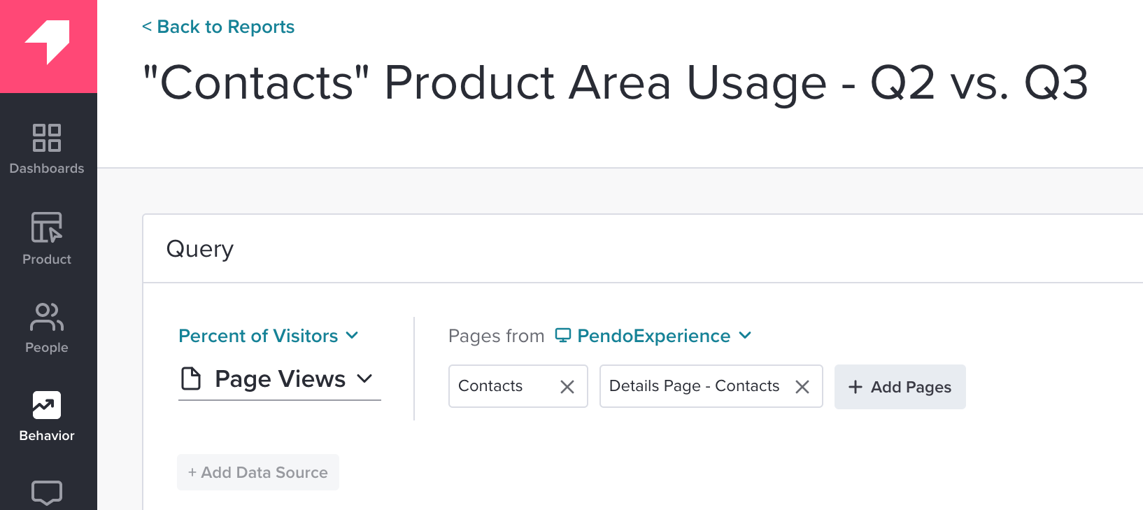
You can also view how user interaction changes over time, including comparisons of specific time frames (e.g., how usage of a feature changed this quarter compared to last quarter).
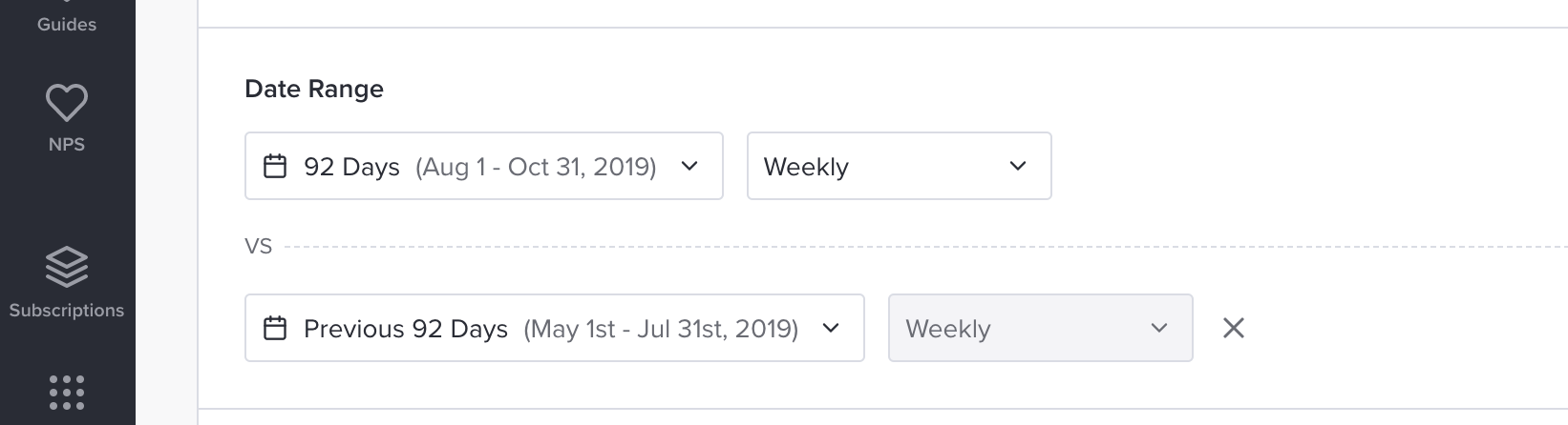
This is particularly helpful if you’ve released an improvement or new feature within a certain product area. Seeing a shift in behavior of a user group before and after the release can indicate if the change is making the impact (e.g., increase in feature clicks, page views, or track events) you desired.
Investigating the “why” behind behavior
If you don’t see an increase in user interaction after a new feature launch, you can use this information to dig in further. Maybe users are simply unaware of the new feature, or maybe your original hypothesis for who will use the feature was off the mark.
As you look for the “why” behind user behavior, Data Explorer’s additional “Segments” and “Group By” parameters can help illuminate trends across different types of customers. For example, you can compare feature usage of a segment who has viewed a guide about that new feature vs. the user segment who has not viewed that guide.
In the image below, users who viewed the “create a contact” guide viewed the Contacts page more than users who did not engage with the guide. In this example, if we wanted to improve usage of the Contacts page, we may want to re-publish the guide to the users who didn’t see it the first time.
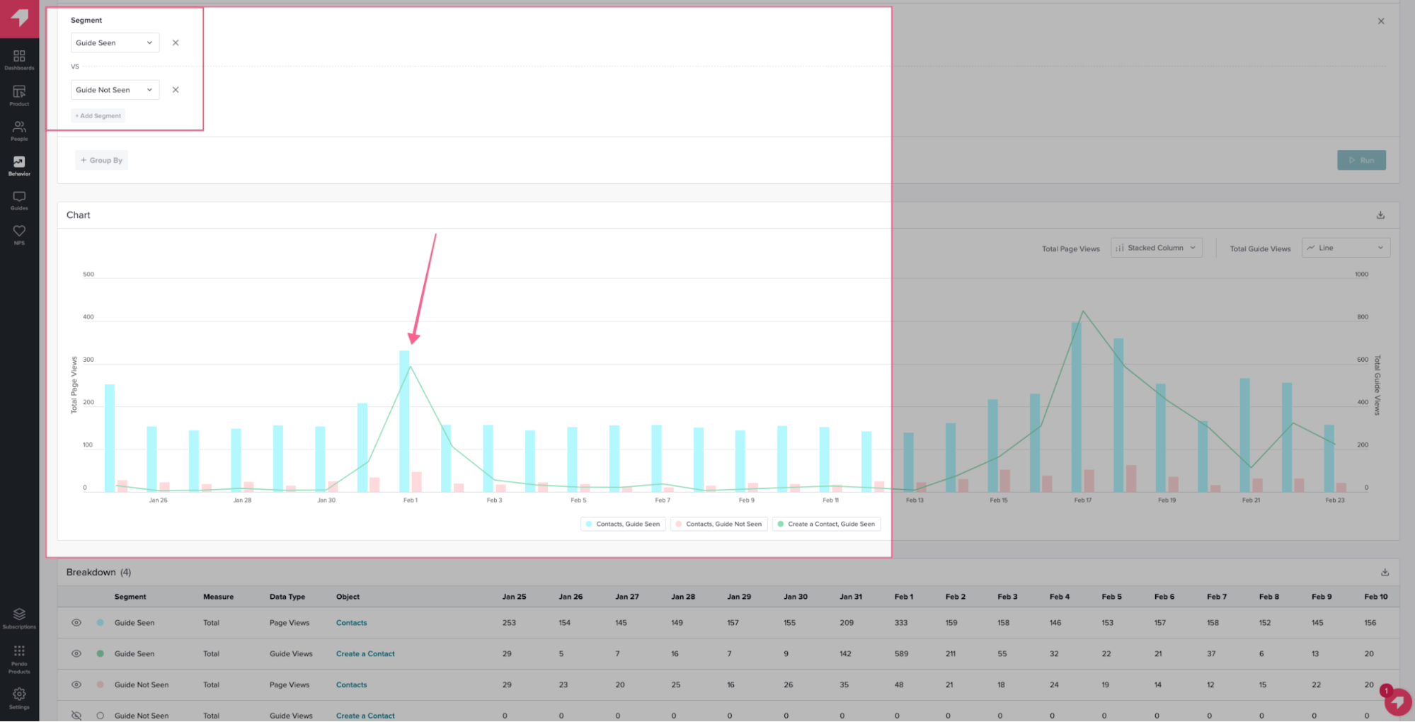
If you find that certain accounts didn’t receive the original guide and have low usage of the feature highlighted in the guide, you can easily export this list of accounts and use it as a topic for engaging them through customer success or account management efforts.
Additionally, if you find that specific users (or visitors) who have not seen a guide are also trailing in usage of that specific feature, you can easily create a new visitor segment in Pendo. This way, you’re able to launch an in-app education campaign and target specific guides to this set of users, encouraging them to try the feature or walking them through how to use it.
Encouraging power user behavior
You can also use Data Explorer to identify frequent users of a specific feature and target guides with more technical messaging to that cohort. For example, users who have interacted with a certain feature a dozen times may have the basics understood, but there is an opportunity to guide these users through more advanced workflows that deepen their usage and the value they derive from your product.
Plus, power user workflows are a good indication of the type of behavior you want to encourage (through guidance or UX enhancements) in other customer segments. Seeing the behaviors of your power users over time is one of the best ways to understand the feature interactions that will help other segments become power users — which can lead to account expansion and upsell opportunities.
Over time, revisiting the Data Explorer report or glancing at a Data Explorer visualization you’ve added to a dashboard can help you not only evaluate this customer segment’s product usage, but determine if you should take additional steps to improve the metrics most important to your business.