Pendo’s goal is to make it easy for anyone to not just have access to product data, but to use that data to drive customer engagement and improve the product experience. To fulfill this goal, we constantly revisit core parts of our product to ensure each tool is accessible and useful to everyone, regardless of their expertise. Recently, this commitment led to Navigating a Navigation Redesign with Pendo“>a new navigation menu. We’ve now released an even larger upgrade: a completely new way to build guides.
In the works for over a year, the visual design studio is our most ambitious Pendo redesign so far. Because it involved rebuilding an existing feature, we had to overcome a lot of assumptions to deliver a tool that truly worked for everyone. Here’s how we used Pendo to manage that process and uncover what our users really want.
Building a Better Way to Build Guides
With Pendo’s legacy guide authoring, when users wanted to customize guides beyond a basic template, they would need some basic knowledge of HTML and CSS. But as more users deployed Pendo across their organization, it became necessary to rethink this process so that even non-technical stakeholders could easily design engaging guides and walkthroughs.
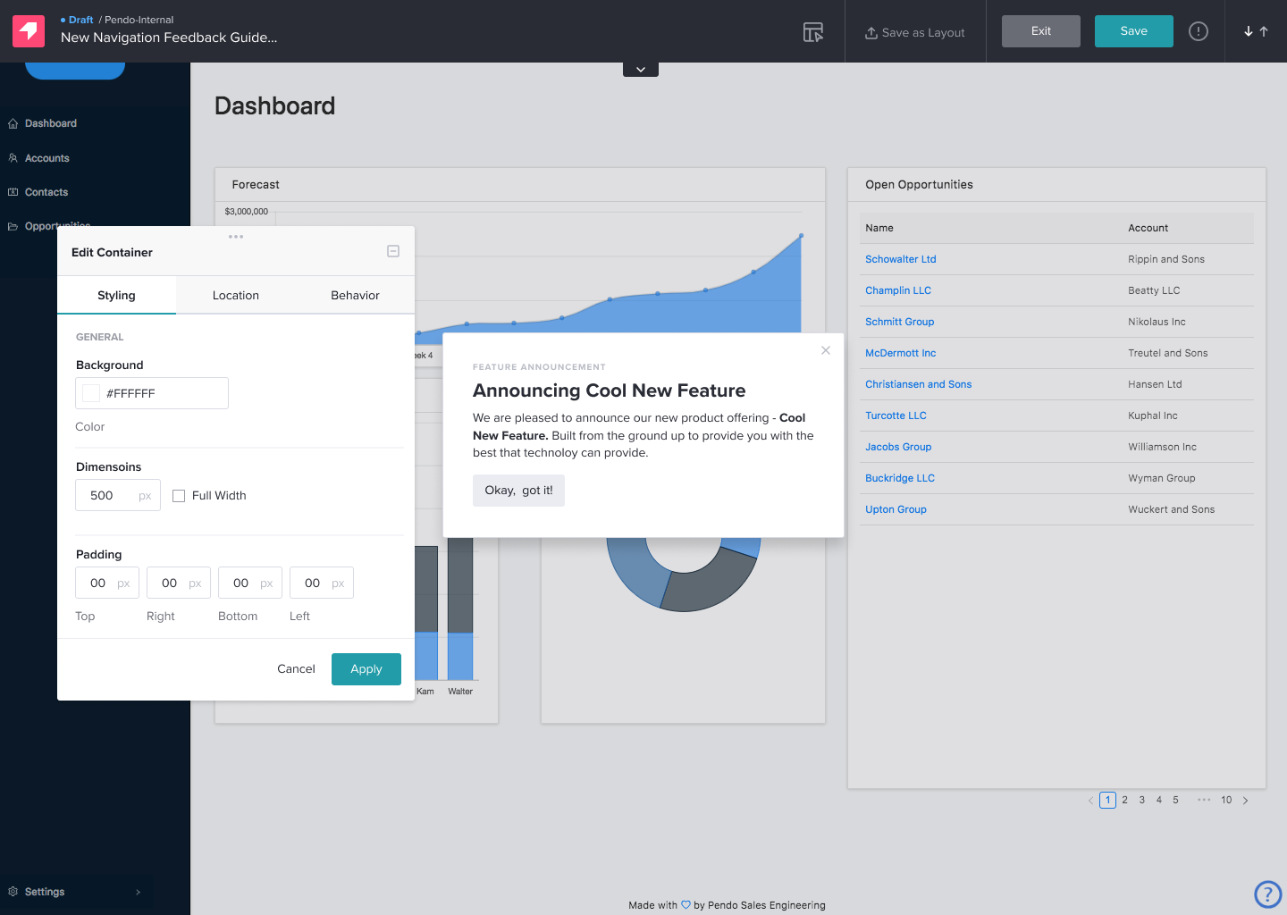
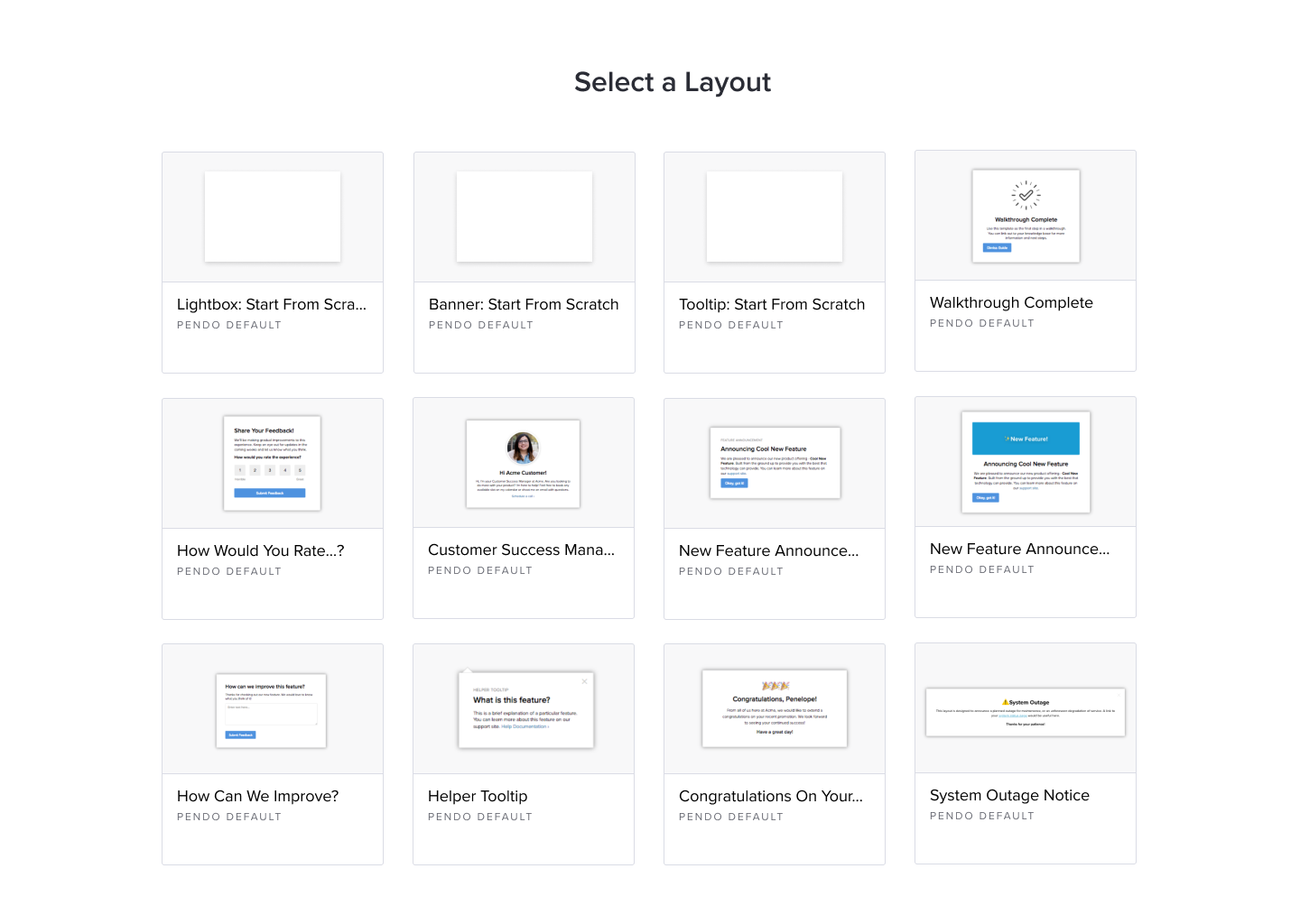
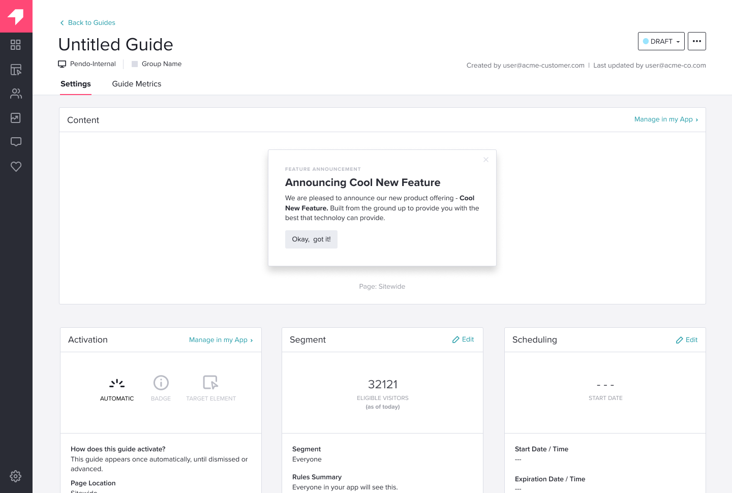
Our solution was to completely reimagine the guide authoring system and replace it with a more visual and intuitive point-and-click interface. Instead of editing code, Pendo users can now create guides, walkthroughs, in-app messages, and more by selecting different “building blocks.” They can then further personalize these elements by choosing from among different layout and design options. This modular approach makes it simple for any user to quickly find and select the features they want, then push out a custom guide—all without relying on any additional support. Learn more about the new visual guide designer here.
Relying on Pendo Data From Day One
From the outset, we knew Pendo would play a large part in supplying us with the data and insights needed to create a tool robust enough for our core power users, yet easy enough for those new to guide building. Having a solid foundation of product and user data allowed us to challenge false assumptions before they could impact our design.
For example, beginning with our initial research, we used Pendo to select users who we thought would provide us with the most useful feedback. We focused on users who had created at least 10 new guides, then asked them (via an in-app message) whether they’d be willing to try out the beta version of our visual design studio. We expected to get the most responses from product managers (PMs). In reality, users in customer success (CS) and marketing responded more frequently, reflecting the fact that they constantly reach out to customers for onboarding and training, and wanted an easier and faster way to build guides.
This finding challenged our original assumption—that PMs were our primary audience—and altered the scope of the project, all before we’d designed anything.
Tracking and Tweaking Along the Way
When we released the beta, we continued to rely on Pendo to visualize how users were navigating and interacting with the design. We tagged different pages and features we wanted to measure, then set specific goals, such as the number of clicks a button received. This made it easy to track the paths users were taking, identify bottlenecks and opportunities for improvement, and quickly iterate on our design.
But Pendo’s deep analytics also helped keep us from drawing any false conclusions from all this data. A favorite example is when we introduced the ability to choose different themes. Because this option was hidden in a drop-down menu behind the “Create New Guide” button, our data was telling us that a lot of users were suddenly clicking on that button. However, we weren’t sure if more users were actually using the new system to create guides, which would have been a major win for us so early on. We tapped into Pendo’s retroactive analytics to find out.
We learned most users were just exploring what was behind the drop-down menu, which meant we still had some more work to do. It was a small but significant finding that taught us the importance of tracking the right elements, tagging the right buttons, and not celebrating too early on. It also highlights the power of retroactive analytics, and the ability to re-organize your events if your original assumptions turn out to be incorrect.
Incorporating Qualitative Feedback
As we continued to test and improve our beta release, we also decided to use Pendo to collect qualitative feedback. After all, while metrics like clicks and time spent are great for measuring the success of functions you’ve built, they are less effective at understanding the need for elements you haven’t built yet. To get this feedback, we included two open-ended questions directed at users who had used the beta five or more times to find out what they liked, didn’t like, and why.
Once again, this data helped us make improvements by challenging our original assumptions about what our users want. For example, we assumed that with the addition of a point-and-click interface, themes, and other interface improvements, users would no longer have the need to edit any underlying code. Their responses told us otherwise. Many of them missed the ability to make direct code-level changes, so we decided to add that option back in.
Ensuring a Smooth Release
Now that we’ve officially launched the visual design studio, we’re busy incorporating Pendo’s analytics and communication features even further. In addition to building guides and tours that will introduce users to the new workflows, we’ve also tagged everything we can for analysis. This will give us complete visibility into user behaviors so we can continue to make more improvements in the weeks and months to come.
You might also like