Every product team has a list of seemingly small issues that nobody gets to. The tab that confuses people. The dashboard that forgets where you scrolled. The date picker that makes you re-enter AM or PM every single time. Bigger initiatives take priority, so these issues stay in the backlog and users keep working around them.
This quarter, Pendo’s design system team stopped waiting for the sprint to address some of these pains. We used AI to find the little things our users complained about most, then shipped ten fixes in two weeks.
Finding signal in the noise
Our customer feedback spans NPS comments, Listen, Slack threads, and sales and support conversations. Reviewing it all manually takes time, and recurring issues are easy to miss.”
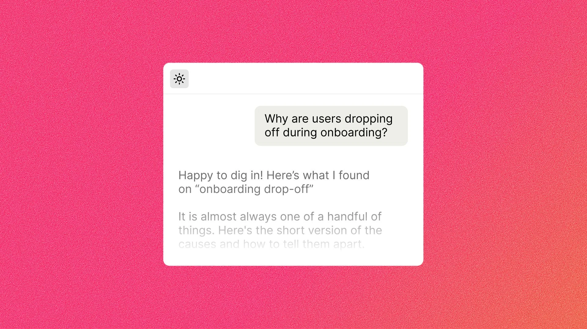
Our designer leading the team was also wearing a PM hat. She and two engineers connected the Pendo MCP to Claude and used it to analyze UX sentiment across those channels in one pass. Instead of skimming comments one at a time, they were able to ask questions like: What are people frustrated by in this part of the product? Which complaints keep coming back? Where is the friction really about UX, and not a missing feature?
What this gave us:
- A single view of UX sentiment. We reviewed NPS comments, Listen feedback, and Slack conversations together to identify recurring issues, enabling the team to see patterns that no single channel would have revealed.
- A shortlist of priorities grounded in evidence. We weren’t guessing which paper cuts mattered. We could point to the feedback behind each one.
- Faster triage. The time between “users are annoyed by this” and “here’s the fix we’re making” got much shorter.
- Designers shipping their own fixes. By leveraging AI, we no longer had to wait for prioritization by product and engineering.
With a prioritized list in hand, she used Cursor to ship a number of UX improvements herself. Small copy changes, spacing issues, inconsistent states, and other polish items that used to sit in the backlog waiting for an open sprint slot could go straight from “I see it” to “it’s fixed.”

That also changed how the team split the work. While the designer took on the little stuff, the engineers could focus on the medium and complex fixes, like component changes and performance improvements, where their expertise matters most. Everyone ended up working on the problems they were best suited for, and the backlog moved faster.
Some of Claude’s suggestions required more engineering work than we could take on in two weeks. We scoped the list together and added smaller issues we already knew about, including several the designer could resolve herself.

A playground to test your design system changes
We also used AI to explore changes to our design system, specifically our work on tokenization. (Design tokens store shared design choices, such as colors, font sizes, and corner radii, as named values that teams can reuse across the product.)
Pendo is full of data visualization, and choosing a palette for charts is harder than it sounds. It has to work for bar charts, line charts, donuts, and heatmaps, and it has to hold up across a dashboard that mixes all of them.
In Cursor, the designer built a playground to compare palettes across several chart types at once. She could adjust a color and see the change across the dashboard without having to recolor chart after chart in Figma.

The same approach was used to explore new fonts, seeing each option in context immediately instead of in an isolated specimen sheet.
Seeing a decision across the whole product
Once our token system was implemented in code, something else became possible: visibility into how a single design decision would ripple across the platform.
Take border radius, for example. In Figma, testing a change across the product is painful, so most teams go with “a few good screens is enough.” But a few good screens aren’t the product. With tokens live in code, we could change the radius and watch it play out across multiple screens at once, including the awkward ones that never make it into a polished mockup.
That’s a better way to make a system-level decision. You can evaluate the change across screens with different layouts and content.
What we learned
A few takeaways if you want to try this yourself:
- Start with the feedback you already have. Connect your product data to an AI tool and let it do the first pass on sentiment. You’ll find the “paper cuts” faster.
- Let designers own the small stuff. Pair AI-assisted shipping with a clear split of work so engineers can focus on complex changes.
- Use playgrounds, not mockups, to compare design options. When you’re comparing options like palettes, fonts, or radii, a live environment beats manual iteration in a design tool.
- Test system decisions in the system. If your tokens live in code, use that to see the full impact before you commit.
- Keep Figma in the mix. It’s still a great place to explore and align. AI just helps you go further, faster, once the idea is real.
The little things add up
None of this is flashy. Nobody writes a launch announcement for a better chart palette or a tidier empty state. But a product that feels cohesive and thoughtful is built from exactly these details, and AI has made it much more realistic for a design team to act on them.
Already a Pendo Customer? Try it yourself: Connect the Pendo MCP to Claude or Cursor and ask your own feedback where it hurts.
And if there’s a little thing in Pendo that bugs you, tell us. That’s how this list got made.