Quantitative, qualitative, and visual data
Quantitative, qualitative, and visual data allow product teams to triangulate their findings and solve problems more efficiently.
Last updated: March 27, 2024
Dive deeper
Table of Contents
What is quantitative data?
Quantitative data refers to information that can be counted, and which is expressed numerically. In general, quantitative data is highly objective and used in decision-making because it is measurable, often standardized, and easy to benchmark and evaluate over time. Quantitative data is valuable for answering questions that involve understanding “what” or “how many” things are occurring in a given situation.
In the world of product management, quantitative data generally refers to product analytics: Business intelligence software that captures and exposes usage patterns from digital products like web and mobile applications via event tracking, event properties, and event and property grouping.
Quantitative data, in the form of product analytics, typically includes key performance indicators (KPIs) and measures like:
- Time to completion: The amount of time it takes visitors to complete all of the steps within a process or workflow
- Adoption: How many users interact with your product (product adoption) or specific features within it (feature adoption).
- Stickiness: How many users return to the product on a regular basis.
- Retention: The percentage of users (or customer accounts) still engaging with your product after they initially install or start using it.
- Time to value: The amount of time from when a customer starts using your product to when they start deriving value from it.
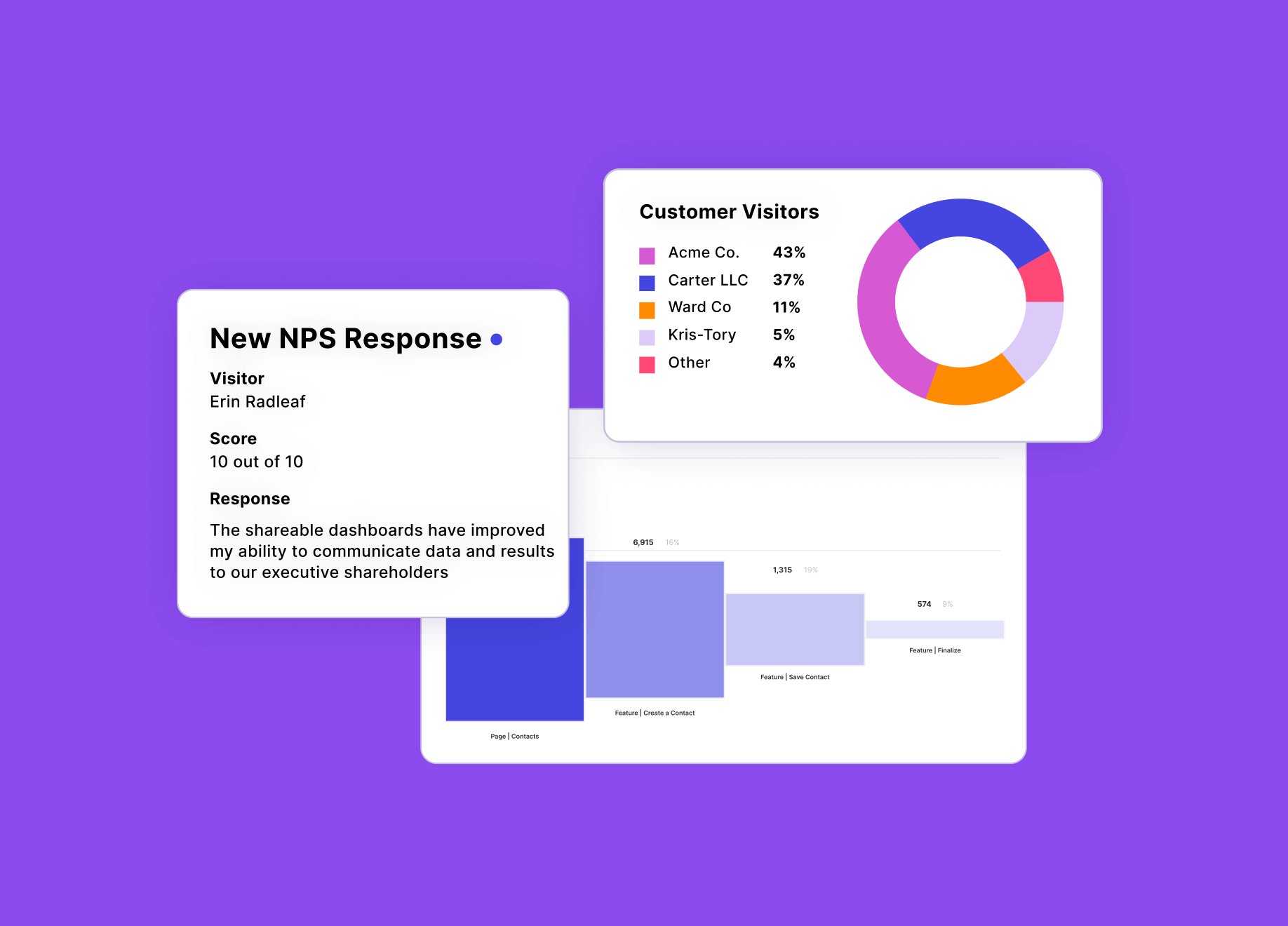
Measurable customer feedback—in the form of Net Promoter Scores (NPS) or Customer Satisfaction Scores (CSAT)—is also a valuable source of quantitative data for product teams. It can serve as an indicator of overall product performance and customer health, and helps product teams determine where to focus their time and resources or understand which customers may be at risk of churning.
Why is quantitative data important?
Quantitative data in the form of product analytics is a critical tool for product managers (PMs) for a number of reasons, including:
- It enables objective decision-making by helping PMs make informed decisions using concrete evidence—rather than subjective opinions or gut feel.
- It provides product performance insights by allowing PMs to track key metrics like user engagement and conversion rates—so PMs can assess the impact of their product and see how it influences overall business outcomes.
- It helps teams improve customer retention by providing leading indicators of churn risk (e.g. low product usage, poor feature adoption, decreased active use, etc.)—so that product and customer success (CS) teams can proactively intervene and get customers back on course.
- It makes prioritization easier and more objective by surfacing issues or opportunities in the product, and enabling product teams to make usage data-informed decisions about where to focus their time and resources.
What is qualitative data?
Qualitative data refers to non-numerical information that is often descriptive and subjective in nature. Unlike quantitative data (which is expressed in numerical terms and can be measured), qualitative data provides insights into the non-quantifiable characteristics and attributes of a situation or phenomenon. This type of data is particularly useful for understanding the depth and context of a situation or for capturing opinions. Qualitative data is often collected through surveys and polls, textual NPS responses, interviews, focus groups, or general observations.
In the world of product management, qualitative data generally refers to user feedback or customer feedback: Information provided by users or customers about their experiences with a product or service. Feature requests (comments, messages, or solicitations for specific features or functionality to be added to your product) are also often qualitative in nature. Some businesses evaluate all forms of user and customer feedback in aggregate in a voice of the customer (VoC) program, which enables them to understand the “why” behind their customers’ feedback, identify common customer pain points, and inform activities throughout the business.
Why is qualitative data important?
Particularly when it comes to building products, qualitative data (in the form of user or customer feedback) is often used in conjunction with quantitative data (in the form of product analytics) to give teams a comprehensive understanding of product performance and customers’ experiences. While quantitative data highlights product usage trends and patterns, qualitative data offers depth and context that helps PMs ensure they’re solving the right user problems for the right reasons.
What is visual data?
Visual data typically refers to information that is represented in a visual format—such as images, charts, graphs, maps, or diagrams. This type of data is used to make information easier to digest and understand by visually articulating numerical values and making trends easy to see. Product analytics tools (like Pendo Analytics) typically include features and widgets that produce visual representations of product data. But in product research and design, there’s also another form of visual data that is extremely valuable: session replays.
In the world of product management and design, visual data can also refer to session replays. Session replay refers to the process of capturing a user’s interactions with a product or application—including mouse movements, clicks, scrolls, and keyboard inputs. These recordings give product, user experience (UX), customer success and support, sales, marketing, quality assurance (QA), and development teams visibility into the complete user experience by allowing them to see exactly how users are navigating and engaging with their products or apps. Session replays are an irrefutable form of visual evidence, providing the behavioral context teams across the business need to influence decisions.
As part of a holistic product experience tech stack, visual data—in the form of session replays—helps teams:
- Understand the user journey
- Identify usability issues
- Validate design and UX decisions
- Optimize conversion paths
- Accelerate product discovery and development
- Improve the customer experience
What is the role of quantitative, qualitative, and visual data in product development?
To build the best products and digital experiences possible, teams need to think of their apps and products holistically—leveraging quantitative data (product analytics), qualitative data (user feedback), and visual data (session replays). Combined, these sources give teams all the insights they need to build the best experiences possible, including how users are engaging with features, what they think about those features, and what specific actions they’re taking as they move through the product.
How do quantitative, qualitative, and visual data work together?
Let’s say, for example, you notice low adoption of a new feature in your product analytics tool. This quantitative data allows you to compare the feature’s utilization against other areas of your product and measure performance over time. With a tool like Pendo Analytics, you can also dig into exactly which user groups are or aren’t using the feature, segment them by metadata or behavior, and see the paths they’re taking to complete the workflows they ideally should be using the new feature to accomplish.
Once you have this quantitative data, you can turn to your user feedback tool to get qualitative insights that can help explain the feature’s low adoption rates. Using a platform like Pendo, you might notice that a number of users have shared feedback about the placement of the new feature—specifically noting that they don’t know where to find it in the product’s user interface (UI). This qualitative feedback helps you identify exactly where users feel the feature is falling short in terms of usability, so you can take the necessary steps to improve its adoption. This feedback is also an excellent source of inspiration for roadmap planning.
Now that you know adoption of the new feature is low and have an understanding of why, you can turn to session replays to complete the picture. Visual data, in the form of session replays, helps you see exactly how your users are moving around in your product, where they’re going, and what they’re clicking on. Looking at session replays from users with low adoption of the new feature, you might discover that people don’t know where to find the feature on your home page—as demonstrated by their continuous cursor movement. Or perhaps you find that they know where the feature is, but are experiencing a bug that doesn’t allow them to use it—as demonstrated by repeated “rage clicking.” If you use a unified product experience platform like Pendo, you could then even use an in-app message to notify users of the bug, or a series of in-app guides to enable users on where to find the feature and how to use it.
By leveraging product analytics, user feedback, and session replays together, product teams can form a complete picture of the user experience and make more informed decisions. This enables them to use resources more wisely, focus on the areas of their product that will deliver the most impact, and get the insights they need to continually improve their offerings.
Why is it important to combine quantitative, qualitative, and visual data?
The combination of quantitative, qualitative, and visual data (product analytics, user feedback, and session replays, respectively) allows product teams to triangulate their findings and solve problems more efficiently.
For example, if user feedback suggests a problem, analytics data might reveal the extent of the issue, and session replays can provide context and details about how users are experiencing the problem. Or if analytics data suggests an issue; session replays can validate broken features, bugs, or user error; and user feedback can highlight suggestions to prevent the issue in the future.
Product analytics, user feedback, and session replays also offer different perspectives on user behaviors. Combining these three sources of information provides product teams with a holistic view into the user experience, helping them understand not only what users do but also why they do it.
What is the value in using a unified platform for all my quantitative, qualitative, and visual data versus point solutions?
Particularly for large, distributed teams, working with disparate point solutions can wreak havoc on your business data’s accuracy and actionability. Because this data is being tracked and analyzed in a number of different places, it can be hard to know which source to trust, and near-impossible to decide which analysis is the most accurate. Relying on a smorgasbord of tools also slows down collaboration, stalls product innovation, leads to the creation of features that aren’t aligned with user needs, and ultimately results in a disjointed customer experience. Plus, multiple vendors equals mountains of paperwork, working with multiple support teams—and typically, a much higher price tag.
Pendo’s unified app experience platform brings all the quantitative (Pendo Analytics), qualitative (Pendo Feedback), and visual data (Pendo Session Replay) product teams need into a single location—giving you a holistic view of your users’ behavior, plus the tools to act on it. Here are a few more ways using a unified product and app experience platform helps your business:
Improved efficiency
Consolidating all your product experience tools and user behavior insights into a unified platform simplifies and streamlines your team’s workflows—eliminating the mental load, context switching, and additional costs that come with inflated tech stacks.
Better data accuracy
When all your user behavior data lives in one place, it’s not only easier to access, share, and act on—but also easier to trust. Because Pendo Session Replay is part of the complete Pendo platform, you can see the behavior behind the data you already collect, building confidence that the insights you’re acting on are sound and reliable.
Easier discovery
If you use Pendo Session Replay, your session replays are accessible from wherever you are in Pendo—making data exploration and product discovery faster and easier. Because all of your quantitative, qualitative, and visual data lives in a single, unified platform, you can go from data point to session replay in a single click, and view the behavior behind the data across any part of Pendo.
Stronger privacy
Pendo Session Replay comes with three fully customizable privacy settings that allow teams to redact or mask sensitive user information. With the flexibility to customize each privacy setting to your exact needs, you can get that balance of insight and privacy just right. And because all of your quantitative, qualitative, and visual data lives in Pendo, you know it’s protected by our industry-leading security and data privacy policies.

You might also like