After building an onboarding walkthrough to welcome, delight, and introduce new users to your product, your mind should immediately turn to measurement. How is the walkthrough performing? Are users getting through the whole thing, or is there drop off? Is this information impacting their behavior? The list goes on.
In reality, you likely won’t be able to answer all of these questions (and other questions of the like) all at once, or right away. The opportunity you do have, though, is to bring an experimental mindset to onboarding: measure what you can, and use this data to improve what you’ve built. With an onboarding walkthrough specifically, small tweaks can make a big difference, and we recommend starting small when it comes to measuring and improving in-app onboarding.
But this type of iterative approach comes with some requirements. It all starts with data, and you need access to a variety of types of metrics in order to get a complete picture of onboarding performance. Below, we walk through the steps you should take to measure the effectiveness of your onboarding walkthrough, so you can ensure it’s making a meaningful impact on your new users’ experience, product engagement, and your business overall.
Step 1: Understand how you’ll measure
Improving your in-app onboarding starts with measuring it. As a first step, it’s important to understand the different ways to measure the impact of your onboarding walkthrough. While a natural first thought is to analyze the specific guides themselves (e.g. by guide views or completion), this only tells part of the story. The best product teams measure onboarding in multiple ways, and it’s by combining different types of metrics that they’re able to get a complete picture of onboarding performance.
Here are three different categories of onboarding-related metrics (which we’ll go through in more detail in the next three steps):
Onboarding engagement: Use these metrics to measure engagement with your onboarding content, like how many people saw and interacted with your onboarding walkthrough and for how long. Measuring onboarding engagement provides a good foundation, but should not be the only way you analyze your walkthrough’s effectiveness.
Product usage: This is where you start digging into how onboarding guides actually changed users’ behavior in your product. Depending on the goal(s) you set, you’ll want to look at product usage across the key features you’re driving users to in your walkthrough.
Business outcomes: Onboarding can make an impact beyond the feature level, and this type of measurement gives you a sense of how your in-app onboarding strategy is influencing your most important KPIs, like retention and stickiness.
Step 2: Track onboarding engagement
As you think about the three categories of metrics outlined in Step 1, it’s best to start with onboarding engagement. This will give you a foundational understanding of the effectiveness of your onboarding walkthrough–how many users saw your guide? How many of them made it to the end of the walkthrough?
When it comes to measuring onboarding engagement, there are a few key metrics to focus on:
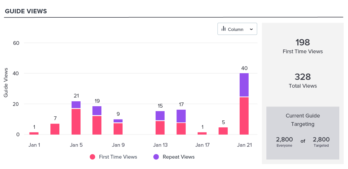
- Guide views: Start by looking at how many users viewed your onboarding guides vs. how many people you targeted. This will help you understand if your walkthrough achieved the reach you anticipated, or if there was an error in setup (or otherwise).
- Guide step completion: Especially useful for onboarding walkthroughs, examine your guide step completion to see if users are completing the entire walkthrough, or if there is noticeable drop off after a certain number of steps. Remember: we recommend keeping your onboarding walkthroughs to four or five steps.
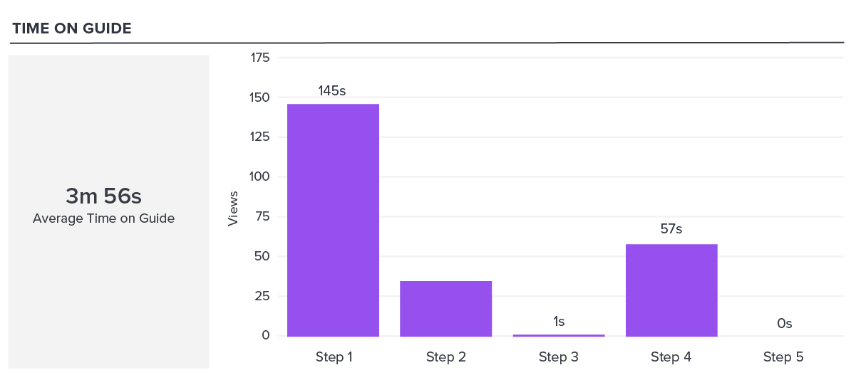
- Time in guide: This is another way to track engagement, and is a good indicator of whether users are seeing value in your onboarding content. If your time in guide numbers are particularly low, you may need to re-evaluate the content you’re including in each guide. Where can you add more engaging formats, like visuals or video? Are there any guides where the language might be confusing to new users?
Once you’ve looked at these three metrics for your onboarding guides, you should start to have a general sense of their performance. Keep this information in mind as you head to the next step and track your walkthrough’s impact on product usage.
Learn how to use in-app guides to build personalized onboarding by taking a self-guided tour of Pendo.
Take a tour ->Step 3: Track the impact on product usage
The next phase of measurement is where things really get interesting. Since onboarding is meant to drive certain user behaviors, teams need a way to understand if the in-app onboarding walkthrough they’ve created is succeeding in this area. This is where you can start to weave experimentation into your onboarding strategy.
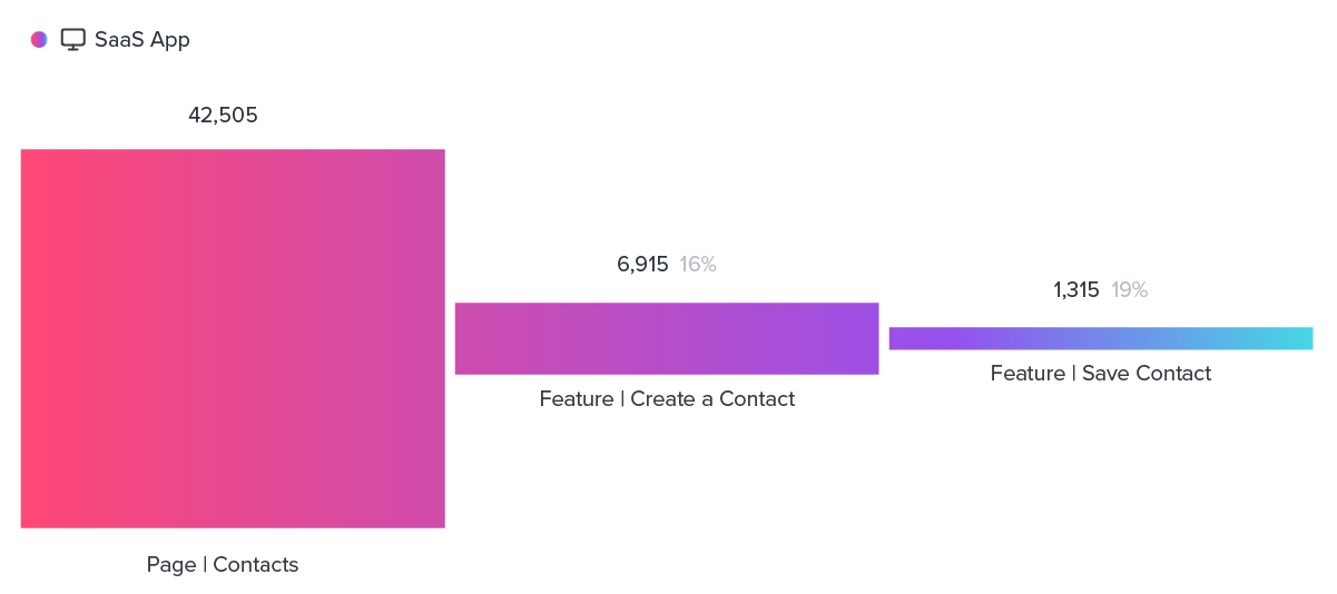
The most straightforward question you should ask yourself is: Did users exhibit the behavior we wanted them to? If you were able to set up a conversion target (e.g. the feature, page, or track event you expect users to engage with after seeing the guide), dig into that data to see if the guide was successful or not. Otherwise, you can use product analytics to track feature usage for the features your onboarding walkthrough directed new users to utilize. If your product analytics tool allows for experimentation, compare the behavior of your control group with users who viewed your onboarding walkthrough–this will help you understand the behavior your guides are (or are not) driving.
You can also use funnels to measure how new users move through the defined steps in your onboarding walkthrough. For example, if you have a four-step walkthrough, build a funnel that mirrors the steps you’re asking users to take. Then, use segmentation to apply a segment for users who have engaged with the guide you’re trying to measure. This will help you see where users are deviating from completing the task showcased in your onboarding walkthrough.
Step 4: Track the impact on business outcomes
In the end, onboarding is ultimately about driving key business outcomes. Your walkthrough may focus on guiding new users to discover and adopt a certain feature, but these efforts play a role in larger goals like customer satisfaction, retention, and stickiness. After measuring onboarding engagement and how your walkthrough influenced product usage, the final piece of the puzzle is determining how (or if) in-app onboarding is impacting your most important KPIs.
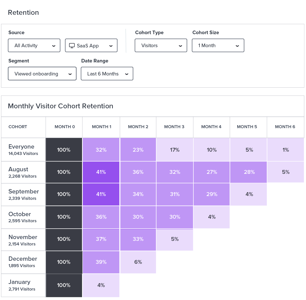
First, create a segment for users who have viewed your onboarding walkthrough. From there, you’ll be able to look at the retention and stickiness rates for this cross section of your user base and ideally, see that your onboarding efforts made a positive impact on retention and product engagement. It’s also useful to track NPS, and filter NPS responses based on whether a user completed the onboarding walkthrough or not. Every company (and product) is different, though, so you might choose to track other KPIs–and onboarding’s impact on them–in addition to the three we’ve outlined in this guide.
Step 5: Make small tweaks over time
You should always revisit your onboarding experience to ensure you’re showcasing the features most important to users so that they find value in your product right away. So, once you’ve gone through these three categories of measurement, you can begin to use these insights to adjust and update your onboarding walkthrough as needed.
Like with many things, small changes to onboarding walkthrough(s) can make a big difference. Here are some ways you might look to tweak yours:
- Swap the order of the steps in your walkthrough
- Remove a certain feature or product area from the walkthrough
- Add additional CTAs to provide more resources once a user completes the walkthrough
- Create multiple versions of the walkthrough to account for a new (or newly important) persona
You probably thought through segmentation when you first created your walkthrough, but it’s also useful to re-examine your segmentation and see if there are additional ways to target certain users during onboarding.